I tried to play around with single characters as well as groups of characters. I really like the dynamic between Ray and Fractal, so tried to play up on their buddy-buddy relationship. Because we want to print these stickers at a smaller size, it was hard to come up with designs with Ignus and other characters because he's so big. I also secretly like Fractal's design much more, and focused on her quite a bit.
As an added bonus, I did a spontaneous suggestion:
With all of these thumbnails, I showed them all to the team, and they voted on the ones they liked the best. Below I've compiled an image that includes all of the thumbnails that are numbered for easy reference; the ones in the green circles are the ones people liked:
Since people seemed to like dead Fractal (number 19), I also came up with a dead Ray (number 30). In the end, I threw the idea out because it was just too silly.
Below are the finalists:
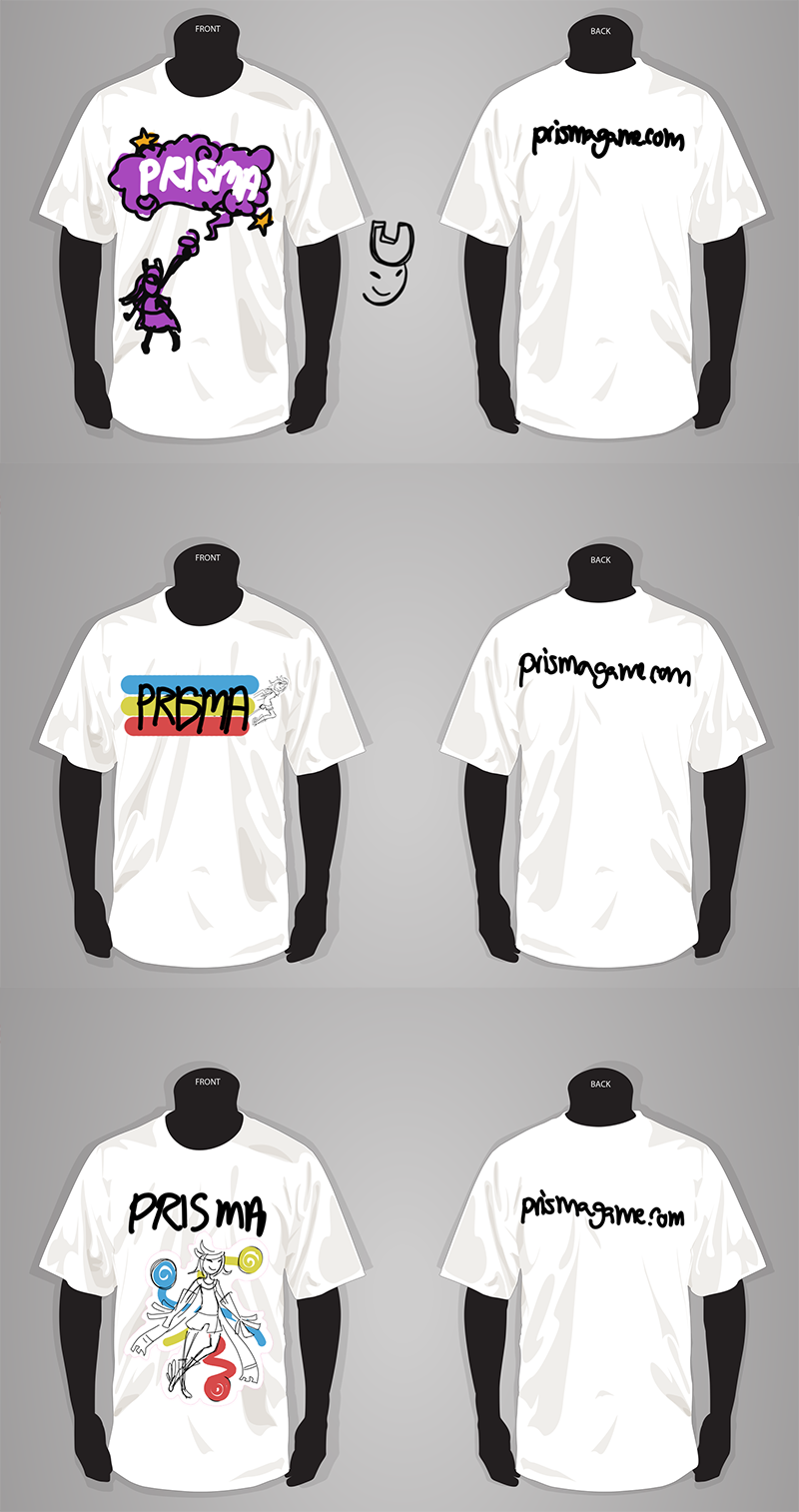
Next, I took a couple of these and stuck them on a shirt:
The first shirt design was created specifically for a shirt, and has the cute Fractal! The other two are altered stickers with Ray as the focus. As a note, these thumbnails are specifically for composition, and are not final color. We definitely don't want to wear blinding white shirts! As much as I like Fractal, I do think Ray needs to be the focus of the shirt. So far, the third design is the strongest, though I'll have to do a couple more iterations.
That's all for this post. Final designs next time (hopefully)!


No comments:
Post a Comment