Monday, June 8, 2015

The complete history of "Life Witch"

I noticed I don't have a master post anywhere of the sweat and tears that went into Life Witch for Project Bala last year, so I figured I could remedy that.  Plus, I still rather enjoy her design, and I think her conceptual journey is pretty fun.

Life Witch started out as, well, not a witch at all.  She was for some reason an angry looking girl in a profane sweater:


In essence, a random doodle born out of boredom.  In a distant corner of my mind, I drew inspiration from the scarf from Stretch Panic, though I've never played it.  But, I've always liked the idea of a sentient scarf.  This doodle was quickly abandoned until a few months later around the beginning of my senior year at SCAD.  To better realize the potential of the scarf, I explored a messenger type character with an animal-like mask:


 The idea was to create a somewhat creepy character hidden behind a mask, arms tied behind their back, and a scarf that would therefore act as their arms.  The more hidden her actual arms were, the better.  I didn't have much time to explore many character designs and thought this was a good enough start, so used this design for my Senior Studio project pitch:


This quick illustration got the reaction I wanted, so I continued to explore the design further.  Shorts turned into a bewitching dress, and the cat tail turned into a giant bow.  Before I knew it, she had gone from a messenger to a witch:

I tried to carefully think how exactly the different layers of her clothing would work.  The most important thing was to hide her actual arms.  The giant bow in the back helps to disguise them, and the poncho completes the transformation.  The scarf also features a gradient to make the scarf wrapped around her neck and the scarf acting as her hands seem unrelated, an attempt to further the illusion.  I tried not to worry about style at this stage, and more so focused on her outfit's functionality.  Once I was happy with it, I tried to render her in the style I wanted:

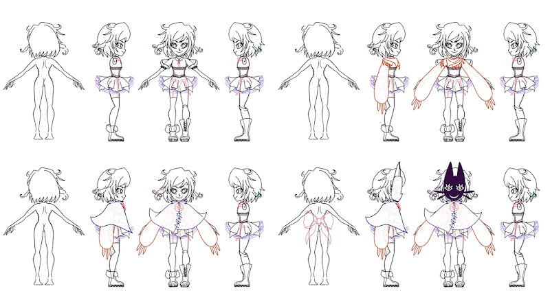
At this point, I decided to remove the mask from her face and instead wear it atop her head, simply because I ended up liking her face.  A weak reasoning perhaps, but a decision that was made nonetheless.  Her character went from creepy, to creepy cute, and cute is always a good thing.  I also decided to lose the scarf wrapping around her neck and decided to go with a scarf wrapping style that drapes closer to the body.  Might as well show off her beautiful neck scar, right?  With a style I was generally happy with, I then went on to creating a turnaround for our character artist (Hank), which required several different iterations (which I've combined into a GIF):


Eventually she was modeled:


And rigged:


And she lived a happy life.  A short, sweet, life.  Until one day, several months after her completion, our professor in charge of our Senior Studio class said that she had a weak silhouette.  We must have had bigger fires to put out with our project that he didn't notice Life Witch for a while (heck, we didn't even notice).  At first, we were like:


But he was right.  Because of the angle of the game, her details were pretty hard to make out:


She unfortunately looked like a walking sack.  There was no way around it at this point, her poncho needed to be removed, the one thing I thought was integral to making her mysterious and hiding her real arms.  Because of how many other things we needed to do, I had to come up with a quick fix solution that would not take away from other parts of production.  I decided to take a render of the current model and alter her from there:


Thankfully, our character artist modeled her actual arms the first time, in case we ever needed them free.  So I deleted the poncho geometry, revealed her arms, and took her scarf to the next level.  Our professor was much happier with this design, and she looked better in game as well: 


Still a little hard to make out, but better.  For a senior project completed in 9 months, and considering all the other problems we ran into and overcame, I think she came out quite well.  Like I said in the beginning, I'm extremely proud of how she turned out, her design, and overall quality.  Here she is fully textured and posed:


And below is her official turnaround from our character artist himself:


Well, that's the end of her journey for now!  It's refreshing to look back and see how far she's come.  I'm hopeful that she will be revived in a future project one day, maybe even Bala itself.  Until then, I'm working on environment stuff for Prisma.  I have some character projects on the side, one of which I should be able to reveal very soon.  Until then, rest in pieces Life Witch!!

Thursday, May 29, 2014

I've never made a complete video before so obviously the first one I make is going to be in Photoshop

I might edit this entry later but.  I updated Bala's website and made out a video of it.  I'm no web designer and this is my first video, but check them out!  I'm pretty proud of what I did!

witchesofbala.com

EDIT: The Bala website sadly no longer exists.  The blog still does!

Here's the video:

Tuesday, May 27, 2014

Last week of college!

Art's been dry this week.  I've been doing a lot of project manager type things, which is hard to show!  I've been gathering images and renders to get ready to seal the deal on school.  Here are the screenshots I've gathered of Bala.  They show the current progress on the game so far, and how the game looks for final school submission!

Hop on over to the Bala blog for renders of Life Witch I posed for the website and other things!


Thursday, May 22, 2014

Baby batty blockade

I've been swamped with going to studios and working on stuff for Prisma, but I've had some time to do some baby tweaks to Bala this week.  I started trying to get out the majority of the place holder art, and most of that is on the HUD.

I started by taking a render of the knife and putting a simpler spell circle (doily) as the background:

Next, I tackled getting in a new mesh for the shield.  I looked up some shield silhouettes online and liked this one:


What I liked about this is that it looks like it has bat ears and bat wings.  At first, I tried to copy this style 100%, and that didn't end up being very interesting, especially because of the size the shield is going to be on the screen.  Instead, I went wild and came up with this: 


You can clearly see the bat silhouette in the shadow, which is great!  Unfortunately, the shield doesn't start out this big in the game.  After getting the shape I wanted, I went into the texture:


The idea here is that the mouth is where the enemy damage goes.  So for example, if an enemy is shooting projectiles, symbolically, it's like the bat is eating the projectiles so they don't hit Life Witch.  It was later suggested to me that I should inset the mouth and give it a bit more depth, but because of the time constraints I'm working under right now, that will have to wait.  I'd really like to explore this more!

With it modeled, I created a HUD icon.  It's my favorite because it's cute:


Here is the HUD icon as well as the shield in the actual game:


I also touched up life bars.  You can see Life Witch's above, which is a standard green life bar set on top of a doily spell circle.  I didn't want the life bar to get lost in the grass, so made the spell circle a nice purple.  Unfortunately, there's still a bit of confusion with the life bar, but solving that problem doesn't seem to be very doable this quarter.

And here's the enemy life bar:


The enemy life bar is now red and has a dark outline.  Now the two types of life bars are very different, so hopefully the confusion between what an enemy is and what isn't is now clear.  Will need more playtesting!

That's all on Bala for now.  I'll have many more updates in the very near future.

Extra: I also tried to do a mesh for the wind HUD icon and....it came out looking like a slinky:


Welp!  Gotta fix it one day, but today is not that day.  The water HUD icon also needs some help...


Thursday, May 15, 2014

Even more stickers!

Yesterday, I started doing some thumbnails for Prisma stickers to give out at E3 (Yes!  We're a finalist!).  I did a lot, so I'm going to throw them all in here!  As a note, the magenta outline is where the sticker would be cut.  In some cases, it was nice to have this guide so I could figure out where to put text or toss in the Prisma website.


I tried to play around with single characters as well as groups of characters.  I really like the dynamic between Ray and Fractal, so tried to play up on their buddy-buddy relationship.  Because we want to print these stickers at a smaller size, it was hard to come up with designs with Ignus and other characters because he's so big.  I also secretly like Fractal's design much more, and focused on her quite a bit.

As an added bonus, I did a spontaneous suggestion:
With all of these thumbnails, I showed them all to the team, and they voted on the ones they liked the best.  Below I've compiled an image that includes all of the thumbnails that are numbered for easy reference; the ones in the green circles are the ones people liked:
Since people seemed to like dead Fractal (number 19), I also came up with a dead Ray (number 30).  In the end, I threw the idea out because it was just too silly.

Below are the finalists:


The next step for the stickers is to do some additional roughs and figure out where text is going to go.  I think we decided to have a sticker that says something like "Prisma E3 2014", as well as a sticker without it.  Who knows how many stickers we will show up with.  Millions, hopefully.

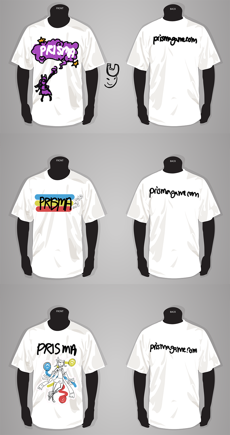
Next, I took a couple of these and stuck them on a shirt:


The first shirt design was created specifically for a shirt, and has the cute Fractal!  The other two are altered stickers with Ray as the focus.  As a note, these thumbnails are specifically for composition, and are not final color.  We definitely don't want to wear blinding white shirts!  As much as I like Fractal, I do think Ray needs to be the focus of the shirt.  So far, the third design is the strongest, though I'll have to do a couple more iterations.

That's all for this post.  Final designs next time (hopefully)!

Sunday, May 11, 2014

Life Witch seriously needs a real name

While dealing with creating and placing assets, I've been doing another nice Life Witch concept in between.  As she no longer has an official concept art of her latest design, I've been doing just that.  Here's a render I drew over in Photoshop to sort out her new design:

I posted this a while back, but it's nice to post again for reference. 

 From here, I started doing some loose sketches:


I ultimately decided to have her in a sitting pose, though it took a while to determine which sitting pose to go with.  In the end, I went with one where the only prop I would need to use would be the one on her person.

With references ready to go, I did a rough of her:


The idea is to have her sitting on her own scarf, and her scarf offering her tea.  The scarf has changed quite a bit from the original concept in the beginning as it is now almost sentient.

From here, I started doing the final lines, though I'm still unsure if I will render her with lineart (always good for a simple sticker though!):

While I was working, I decided to change the scarf to make it look more like she is sitting on it.  Additionally, I got rid of the tea.  Since the scarves are still undone, I could change my mind and change it back or think of something else completely.

So that's the progress on that so far!  I had a lot of trouble figuring out her legs, and soon after drawing them took a break.  I'm still on break and haven't touched it since.  I hope to have this finished before Thursday! Only time (witch) will tell....  

Quick & Dirty Grass

I'm a grandma with a foggy memory, so I took some step by step screenshots of how I did the grass for Bala.  I learned a lot doing this and hope to make better grass in the future.  For now, this is the final product:


The way Bala's collision is set up, our ground has to be completely flat.  To offset this, we will be placing baby grasses in some places, as shown below (as an example; placement not final):

But this post isn't about baby grasses. 

The first thing I did was to create a patch of grass:


I tried to capture the general shapes, and also made sure not to leave it a solid color.  The tiny amount of detail really does make a difference!

Next, I took this patch of grass and made it a solid color in order to make a brush:


To do this in Photoshop, go to Edit > Define Brush Preset..., name your brush, and click OK.
Ta-da!  Patch of grass brush at your service.

It's important to note that if you want a completely opaque brush, the image you use needs to be black.  If you use different colors or grays, Photoshop is going to translate those things into something that is semi-transparent.  Unless that's what you want, it's something to keep in mind as you work on your brush. 

With my new brush selected, I went to Window > Brush, and played around with some brush settings:


I adjusted Shape Dynamics and Scattering in order to get the desired effect of many patches of grass.  With this, I can create a lot of grass in one brush stroke.  The set up is finally done!  On to the actual texturing.

I started out with a base color, and brushed on some messy grasses:


Whoa, gross!

To blend, I used some watercolor brushes to calm the strength of the grass down:


With the grass calm, I turned it back up by brushing on even more grasses of different shades of green:


Calm it down again with some watercolor brushes:


As you can see there's a bit of back and forth.  Paint on grass, and dull it out with a good blending brush.  Repeat this process until you are satisfied with the result.
Next, I started placing the original detailed patches of grass:


I continued to do this, but after a while started placing patches of grass at 37% opacity to calm them down:


In the game, the above texture looks like such:


A lot better than before!  Because this was for testing, I didn't worry about seams or if it covered the whole ground.  With this test, I decided I needed more patches of grass (A LOT more).  The ground still looked way too flat in terms of color variation.

Many grasses later and making the grass tilable, I arrived at the following result: 


And there you have it, quick and dirty grass.